When it comes to informing clients, executives, or your boss about what it is you are doing as the video conferencing or unified communications (UC) manager, there’s no better tool than quarterly reporting. However, conducting a good quarterly meeting is harder than it sounds. You have a few challenging questions you’ll want to answer:
- What’s are the most meaningful metrics that should be included?
- What are the data stories you want to highlight?
- What are your biggest accomplishments?
- What are the areas you can focus on to make the largest impact?
- What do you need from your audience to accomplish your goals?
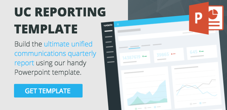
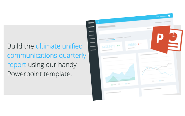
The other important component is to make this all highly relevant to your audience, show the value, and gain their buy-in. There are quite a few resources for generating great quarterly reports for marketing, sales, and development meetings, but we struggled to find a template that covered all these bases for UC teams – so we made one!
This blog is designed to compliment our downloadable, unified communications powerpoint template. Here are a couple resources I really like for general rules for good slides. Not every presentation needs to be a work of art, but by putting in a little effort to get better every time, eventually you create a lot of great presentations.
- 10 tips on how to make slides that communicate your idea, from TED’s in-house expert (Aaron Weyenberg) – TED.com
- How to Create Presentions that Don’t Suck – LifeHacker.com
- How to Get Rid of Crappy Presentation Slides – StickySpy.com

From what we can find, the experts all seem to agree that most of the work for making a great presentation happens long before you even start making slides. In fact, making slides should be the last thing you do. Being fully prepared to execute a productive meeting is far more important than making attractive slides, but having a well planned and meaningful presentation can make all the difference.
Highlighting The Benefits of Unified Communications to Establish Context
It’s wise to take a step back and get a lay of the land before you dive in. Examining the benefits that unified communication has had on your company (or hasn’t had) is critical to setting meaningful goals and audience expectations.
Here are some common benefits that company’s see from unified communication programs that you could evaluate and leverage in your presentation:
- Expansion in recruiting programs and an increase in quality hires
- Better team facilitation and communication
- Extension of corporate network and hyper-mobility
- Operational cost reduction
- Increase in “green” operations
- Integration of collaborative communications into applications and business processes
- Boost in employee productivity
- Increase company revenue
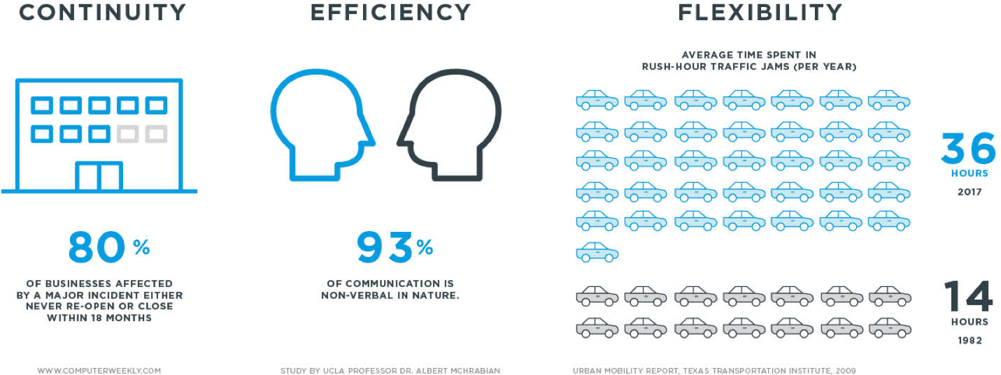
According to Inc.com, combining multiple communications into a single solution can produce some staggering results. Free free to leverage the following stats (since they are from a credible source), or adjust them to speak to your specific businesses success:
- 49% of user organizations save up to 20 minutes per employee daily by reaching workers on the first try
- 46% of user organizations realize travel savings of more than five days per employee annually
- 68% of user organizations report productivity improvements between geographically-dispersed functional groups
- 50% of user organizations save up to 20 minutes per employee daily from more efficient message management
- Over 75% of user organizations experience improved productivity of employees across geographically-dispersed locations due to voice and video conferencing
- 67% of user organizations report increased mobile worker productivity and faster problem resolution
Here are a few solid resources to help you articulate the benefits of unified communications for your company during your presentation:
- Benefits of Unified Communications – Digium
- Top Five Benefits of Unified Communications – Elitetele.com
- The Pros and Cons of Unified Communications – Inc.com
Take some time to analyze the benefits your unified communications program brings to your organization, and what it lacks. For some, the benefits may seem obvious, but it’s important to set the context for everyone who attends your meeting or views your reporting presentation.
BONUS: It’s pretty easy to find great little infographics you can use for this purpose – simply take a look at our curated collection of UC infographics on Pinterest. I personally think that Lifesize does a great job with stats about video and UC, here are some of our favorites.
Setting Clear Goals for Your Presentation
Once you have pinpointed the benefits of unified communications, you’ll want to share your goals. Your goals could be double down on a benefit you’ve identified, improve something specific you’ve found in your analysis, or something a little more general. Here are several high-level goals that our customers have found resonates well with their stakeholders:
- Grow the use of video collaboration for an improved return on investment.
- Make all communication options as easy as picking up a phone or sending an email.
- Enable our organization to communicate over the best medium, not just what is nearby.
Sometimes you have a specific agenda for the quarter, like “select a new bridge technology,” or “create a plan for next generation desktop collaboration.” Other times it may be more routine, such as “update on growth of usage and impacts on network performance.” No matter the case, the average quarterly meeting contains 2-3 of these goals. Trying to accomplish more than 3 goals in a single meeting can be challenging. Keep it focused, relevant to your audience, and achievable in 30-45 minutes.
Finding The Metrics That Matter Most (The Hard Part)
We really need to write a post on this topic soon. You know what, stay tuned, we’re going to make it happen. It is decided!
For now, we’ll say that good metrics don’t lie, and great metrics help people define direction, and when/how goals can be achieved. To get you started here is a list of metrics you can drill into to help you not only set goals but also estimate what it will take to get there:
- Video Minutes
- Audio Minutes
- Meetings
- Calls
- Participants
- Call Success Rate
- Average Call Quality
- Utilization Rate (for endpoints or infrastructure)
- Active Endpoints
- Active Users
Now, the list could go on for ages, but those listed above will get you headed in the right direction while asking the right questions. Much like with other industries, unified communication metrics can be difficult to obtain and sometimes hard to trust. The primary concerns for manufacturers of endpoints and infrastructure are reliability, ease of use, and quality. Unfortunately, this means that many metrics are delivered by individual devices which can often lead to an incomplete picture and messy CSV files. Other times unified communication managers find themselves short on data, since most manufacturers only store for short periods of time (much less than a quarter). This means managers need to become an expert at pulling, combining, cleaning, organizing, and creating charts and graphs every few weeks which can be impossible.
Fortunately, Vyopta has been tackling this very problem for nearly a decade when we started deploying large video conferencing networks at customers around the USA. Our monitoring and analytics product, vAnalytics was designed to make gathering, organizing, and reporting on UC something that takes minutes instead of days.
You can do it the old way, but why would you want to? Although our downloadable Powerpoint template relies heavily on reports that are easily available in Vyopta’s vAnalytics product, you’ll find a framework that can work for nearly any video conferencing or unified communications vendor solution. In our Powerpoint reporting template you’ll find three, primary categories:
- Adoption – Who is using it, how, how much, when, and where (so you can help people use it more)
- Performance – Assessing call quality, user experience quality, and UC’s impact on the network
- Efficiency (are we getting what we paid for, what is the ROI)
When you think of it this way, it becomes easy to see which metrics can be used for which types of goals. As an example, here are some common ways you can slice data when discussing adoption;
| EXAMPLE ADOPTION GOAL: “Grow Video Collaboration” |
|
|
EXAMPLE GOAL: “Get More Out of Our UC Investment” |
|
Telling Your Unified Communications Metrics Story
If I want to look at Video Minutes, I may feel it is a simple summation on the surface, but it can quickly become tricky if you start asking the right questions.
- What about calls between two people, do you count both of their minutes or just the call length?
- Does this apply to larger meetings?
- Do I know that calls reported by multiple devices aren’t counted twice?
- Do presentation channels in video calls count as separate participants or minutes?
- What about calls from desktops to rooms or bridged meetings?
- Does this include test calls or calls where people are recording (like a training)?
It’s important to ask yourself the right questions to make sure you’re presenting data thoughtfully and accurately.
- Good metrics should also have historical context. Is this number going up or down? If I have a lot of bad calls or call failures, is that better or worse than before? It is important to express this context in the meeting. You may know this data like the back of your hand, but it’s very likely that nobody in your audience does. The top level metrics are your first chance to start telling your story.
- Good metrics should also anticipate questions. If I have a lot of bad calls, do I know why? Are there any common trends among these calls that I can highlight? It’s up to you to decide how much detail you show beyond the first level of KPIs, but it may be useful to plot changes over time, especially if there is an event (like a technology purchase or deployment) that showed a big impact.
From here, it can be very helpful to have a colleague review your metrics and come up with any questions or outside influences you may have missed. They can also tell you if a metric or chart is “just noise” and doesn’t support your end message.
Here is a quick video to help you find the right metrics and reports needed for your quarterly presentation.
Gaining “Buy-In”
The whole point of holding a quarterly reporting presentation with key stakeholders is to gain buy-in. However, this is what most people forget. Great sales people call this part of the meeting, “The Ask.” Either way, this is the point of the meeting where people become instrumental to the solution.
To help you nail this portion of the presentation, you need to come up with some recommendations, think them through, put together some rough outlines of plans, and predict things like impact and cost. The reason for this is simple: there are a hundred ways to build a bridge, but they are very different if you are using rope, wood, stone or steel. You don’t want to suggest a building a steel bridge when all you have are hammers and a “rope” budget.
This forethought is not only appreciated by executives, it’s necessary to get things done. If you have an especially energetic audience, it might even be wise to create some rough assessment of the various options. A simple grid rating a few options by metrics like cost, complexity, and feasibility might be more than enough.
Here are some examples of recommendations for, “getting the most out of our video investments” you can use for inspiration:
Grow Adoption by Launching a Targeted Campaign with HR – We have capacity and licenses available, so what we need to do is run an adoption campaign. I (UC Manager), can deliver stats about top users and find low-performing groups, and I can provide training materials and manpower to teach users. To do this I need HR’s help to leverage your monthly communications and your ideas for how to further motivate employees.
Relocate Unused Endpoints – We can avoid purchasing new endpoints this year simply by relocating ones that aren’t being used. I need Facilities help to make this happen.
Final Thoughts
People tend to think that the act of building slides will help them to create the ideal presentation. Instead, slides should come last. There’s quite a bit of planning and analysis that should come first.
Looking to make your current presentations better or just want a place to start?
Grab our Unified Communications Reporting Template. You’ll find over 40+ slides with examples that already look great, include tips for what data to use, have advice on how to discuss said data, and contextual help as to where you can find the information.