Hello again! First of all, happy holidays to all our customers around the world and thank you so much for your support this year. If you are still in the office, then congrats to you for being an IT All-Star (or just someone who used up all their vacation in the summer). To help make your week a bit easier, we have updated our Historical Analytics and Real Time Monitoring products with a ton of awesome features.
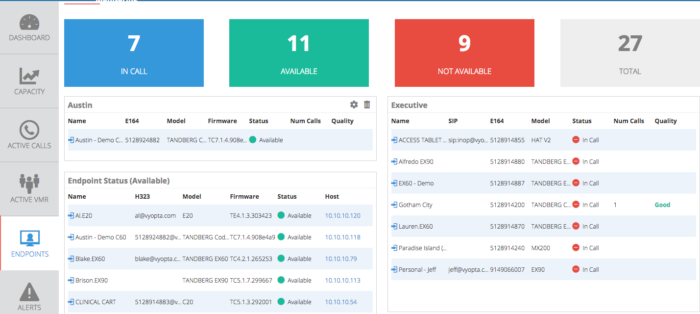
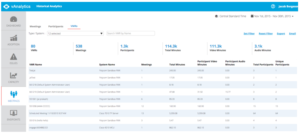
1. Adding any panel to the dashboard in Real Time Monitoring:
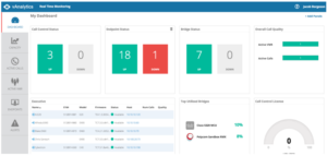
As you can see, I created a custom panel for Executive Endpoints in the Endpoints tab, and then added it to my Dashboard so I can more easily monitor and proactively solve their problems to prevent angry visits to the IT office. Adding any panel is easy, as you roll over any panel in the Capacity or Endpoints tabs, there is now a symbol that pops up in the top right. After clicking, a simple dialogue box pops up to confirm and it is done! Have fun building custom dashboards.
2. Changed Endpoint Categorization for Cisco
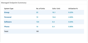
Previously, we were using the categories in the Cisco Endpoint Matrix document, but we heard from customers that they were thinking about video phones and older endpoints differently (turns out you guys wanted to know if all phones with video were being used for video. crazy). Therefore, we changed the DX650, E20, and any phone models with video integrated (8845, 9951, etc.) to now be classified as “Personal” Endpoints for both Historical Analytics and Real Time Monitoring.
Note: Real Time Monitoring does not apply to “Phone” or “Software” type endpoints.
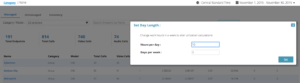
3. Configurable Utilization % Parameter
You guys are tough customers! You wanted to view utilization according to your work days, not the traditional 8 hour day, 40 hour weeks that has been documented since the 1940’s. You can now set the hours per day and days per week you want to use to calculate the utilization percentage of your endpoints in the Managed Endpoint Summary panel…
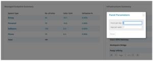
…as well as in the dashboard and endpoints tab.
Here is the formula used to then calculate the percentage for each endpoint:
U% = Hours Used / {Hours per Day * [(Days Selected/7) * DaysPerWeek + RemainderDays]}
Example:
22.59% = 49.7 Video hours / {10 hours per day * [ (30/7) * 5 WorkDays + 2] = 49.7 / (10*22)
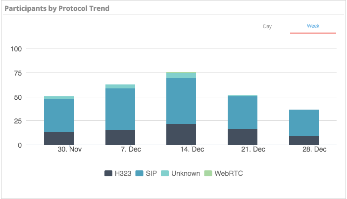
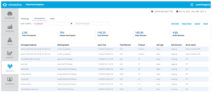
4. Participants by Protocol Summary (Dashboard) and Trend (Adoption)
This new panel highlights the total distribution of participants by protocol type (WebRTC, Lync, SIP, H323, etc.) out of all calls. This helps you identify usage from browsers, new bridge technologies, Lync users, hardware, and software endpoints. The trend panel helps you understand how these users change over time and lets you know generally how your users are connecting with each other. It’s pretty useful.

5. Participants and VMRs Sub-tabs
These new sub-tabs highlight call details from a new perspective to list all VMRs from all vendors in order to evaluate their usage and adoption. You can look at audio vs video usage, usage by system (server), and total vs unique participants.
The Participants sub-tab shows all calls by bridge, technology, protocol, and call type. We at Vyopta (and you guys as well) find it useful to dig into the technical data for participation in video collaboration rather than relying on user surveys that nobody responds to seriously.
6. Dynamic Totals:
Clicking on the Legend in various dashboard panels now changes the Total metric inside that panel. This makes it easier to understand the impact that certain components of usage have on the total. It’s fun when numbers change as you click on them!
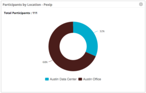
7. Pexip Usage By Location Node:
For Pexip deployments, there is a specific architectural need to understand usage according to virtual “Location Nodes” that are groups of virtual machines that balance the conferencing load between them. We created this specific panel to address that particular architectural concern. Look for more along these lines in the future as we get more detail from Pexip users!
8. Various Usability Enhancements:
- No more double scroll bar on the right-hand side (we REALLY like scroll bars, but found out that one works better than two).
- Tabs on left hand are now sticky as you scroll down, so you can always see them (through research, we discovered it was necessary to see them so you can click on them).
- Capacity panel details (click through actions) now appear where you clicked instead of at center of page, which sometimes made them tough to find, which wasn’t good.
9. Various Data Processing Enhancements:
- Automated synchronization of adds, changes, and delete operations of endpoints managed with TMS and RPRM (turns out customer really dislike doing the same job twice).
- Capacity panels now show data in fractions for devices that use fractional licensing (TPS, Acano, and more)
- All Utilization percentages now show increased decimal accuracy out to 0.01% elements (exciting!)
- Key Summary Metrics now display decimal points (we love decimals).
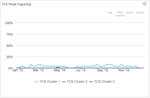
BONUS: TCS Capacity Monitoring
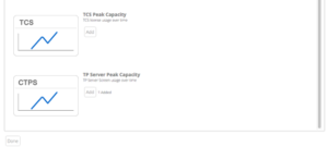
You can now add and monitor the historical usage of the Cisco Telepresence Content Server just like any other piece of infrastructure. You can click on any point in the graph to see all the calls on at that point. You can also look up all the TCS calls in the Meetings and Endpoints sections of the tool in order to look up specific CDRs from TCS calls.
And that’s it for 2015! See you all next year!